In my last post I discussed designing a book cover, examining how cover styles differ between genres and authors. I also introduced the cover I’d knocked up for my own book, The Witching Hours. Actually creating the cover was pretty enjoyable, and didn’t require any specialist software or skills. In this two-part post, I’ll take you through how I built both the front cover for my ebook and the composite front, back and spine required for the printed copy.
Prepare your canvas
I used Microsoft PowerPoint to create my ‘canvas’ – it’s software I’m familiar with, and one which I think offers pretty flexible formatting. After surfing around for the right dimensions for an Amazon ebook cover I found this helpful blog which gave me the right size: 42.3cm by 63.5cm; portrait.
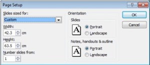
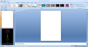
This provides the correct dimensions for an ebook cover, but my printed book cover used slightly different dimensions. But let’s not over-complicate at this stage. We have our canvas.
Choose your image
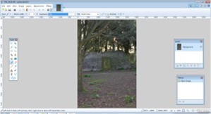
There are two kinds of image you can use on your book cover – those that belong to you already, and those which need to be bought or used with permission. In either case, you will likely need to be edit the image in order to fit the format of our canvas. I used Paint.NET for my photo-editing. It’s a free-to-download program for Windows that was originally conceived as a superior replacement to Windows’ own Paint. I used my own photograph for the cover, after teaching myself how to tie a hangman’s noose and scouting for potential locations. I inserted my image into PowerPoint, resizing and cropping till the image fit the dimensions of my canvas. Then I copied the correctly-proportioned image into Paint.NET, filling the canvas with the image.
Edit colour levels
I’m not too au fait with photo-editing, and wanted to keep my alterations simple. My first change was to de-saturate the image, reducing the vividness of colour for a bleaker, spookier appearance.

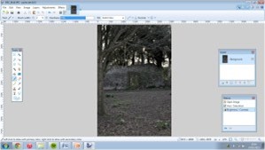
After this, I darkened the image (this is the cover for a ghost story, after all) and heightened the contrast.
Add blurring
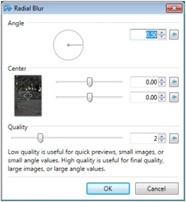
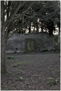
When investigating book covers, I noticed that photographs would often have a blurred effect to highlight or de-emphasise patches of the cover. I used a radial blur effect on my image, centred on the gateway in the centre. This blurred the sides of the image whilst leaving the centre in focus, drawing the eye towards the centre as well as providing a distorted look to the tertiary areas of the image, as if the scene were affected by magic or witchcraft. I felt that only a slight blur was enough to achieve a subtle effect.
Emphasise focal points
After adjusting colour levels and adding my blur effect, I felt the hanging noose in my image blended a little too well into the background of the scene. To emphasise it, I first duplicated the image within Paint.NET and placed it on a second layer, exactly over the first. The I made the background layer invisible.
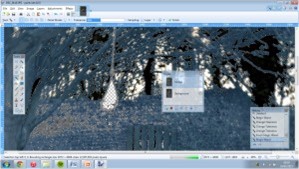
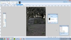
Using the Magic Wand, Lasso Select and Eraser, I cut away the rest of the image from the noose. When I made the background layer visible again, the image seemed to return to normal – however, the noose was now on its own layer. This meant I could now adjust its colour levels separately. I reset its saturation level and brightened it slightly – enough to make it stand out a little against the murkier background. Then I adjusted its hue, lending it a slight green tint (a nod to a plot point in the book). I also turned the opacity of the layer down a little, so that changing the second layer would have a slightly ghostly effect atop the background.
Add text
I saved my final image as a Jpeg and inserted this image into PowerPoint. The dimensions fit exactly since the image was copied from PowerPoint in the first place. When adding text, I used a text box of the same width as the slide, so that centring text would centralise it in relation to the image as well as to the text box. Editing text is, in my opinion, easier in PowerPoint than it is in Paint.NET.
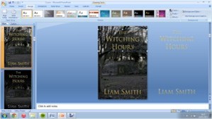
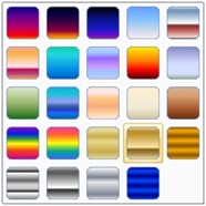
For my font, I chose Trajan Pro. It came ready-installed on my computer, but more fonts are available around the internet – these might have copyright restrictions however, like images. I used a gradient-fill on my text to give it a more tactile appearance; PowerPoint has several default colour sets to choose from, including the gold and silver that I used. The colours in these sets can be edited to further tailor the effect to your taste; I removed a few till only three different colours remained in the gradient, in order to prevent itt appearing too stripy and busy. I also added a shadow from the text effects options, to give depth and definition to the text.
Add darkness
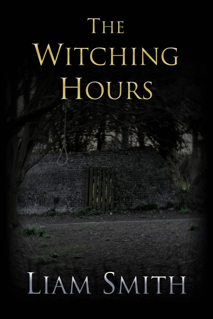
When I asked for feedback on Twitter, many said the cover needed to be darker. After experimenting unsuccessfully with brightness and contrast adjustments, I settled on adding a shadow to the top and bottom of the cover to produce an overall darker result.
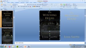
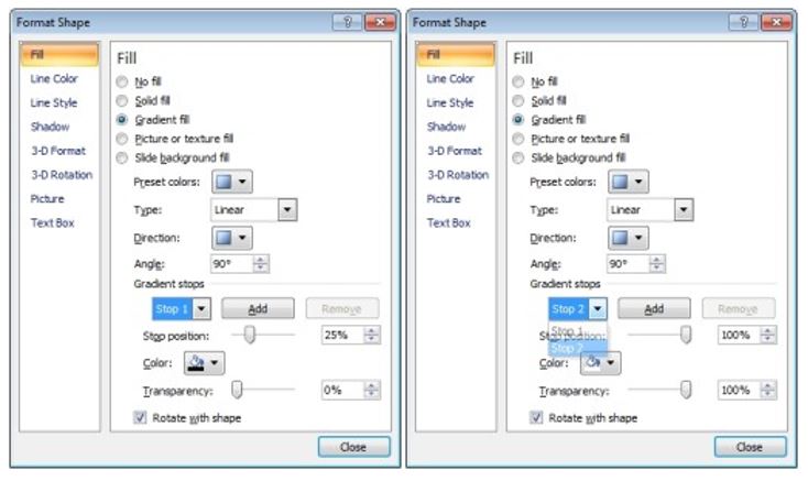
To achieve this effect, I inserted a rectangle from Autoshapes. Using gradient fill again, I set up a gradient of black and white, setting the white’s transparency to full. This created a gradual shadow effect. The point at which one colour becomes the other is called a stop position in Powerpoint – I set the stop position for the white at 100%, but tried different stop positions for the black in tandem with stretching the rectangle’s shape over the cover itself. Ultimately, I used a stop position of 25% for the black.
Finish and export
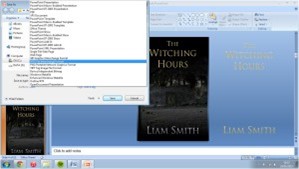
I checked over the completed cover in Slideshow mode before deciding it was fine. PowerPoint has a function to save as a Jpeg file, a format preferred by Kindle Direct Publishing. This will export everything on the slide whilst omitting anything that doesn’t fall within its boundaries, maintaining the established dimensions. For example, my shadow boxes overlapped my canvas – these were cropped to the correct size as part of the saving process.
With the image saved, the cover was finished and ready to upload.
There’s a deal of satisfaction to be had from wrapping your book up in a cover you’ve made yourself – in for a penny, in for a pound, after all. The idea of it is a little daunting but I found that a good result is achievable with no specialist software and with only basic photo-editing techniques. I’d encourage anyone to give it a go – maybe whilst waiting for feedback from their proofreaders…
Creating a composite cover for the printed version of my book comprised different procedures – in my next post I’ll provide a walkthrough of this process and clear up some of the parts I found most confusing and challenging.

Really interesting and thorough guide to PPT guides, Liam. I didn’t know that E-books synched with this programme. I assumed Adobe Photoshop would have been preferable but you obviously made it work effectively for your genre.
Best of luck!
Glad you found it informative! I’m sure Photoshop would be a great choice for most writers, but I’ve never been too adept at it – hence defaulting to Powerpoint and Paint!
Thanks – great to hear from you!