I watched Pan’s Labyrinth, Guillermo del Toro’s masterpiece, a couple of times when I was a teenager. I thought it was brilliant then. But just now I watched it for the first time as proper adult, and I’ve gone from merely thinking it was great to considering it one of the best films ever. Here’s my… Well, less of a Pan’s Labyrinth review, more of a Pan’s Labyrinth reflection. Why I think it deserves to go down in history as one of the most important films ever made.
It treats fantasy and drama as equals
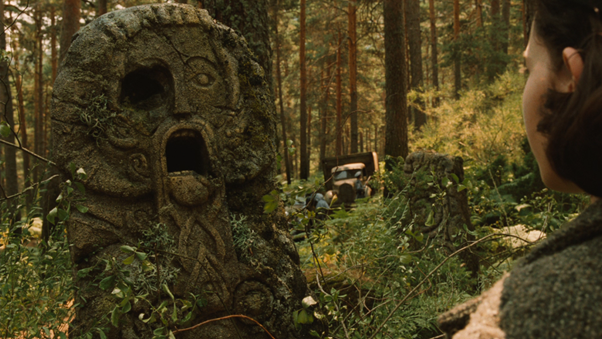
Pan’s Labyrinth is, of course, a fantasy film. What’s more, it’s told through the eyes of a child protagonist: the imaginative Ofelia (Ivana Baquero). But del Toro knows that the true purpose of a fairy tale is to provide a coping mechanism for the horrors and dangers of the real world. It’s not just an excuse to include unlikely creatures and CGI-heavy locations in a story. Accordingly, he doesn’t labour over matching the fantasy and drama turn for turn. He lets both breathe as gripping stories in their own right and lets the viewer reflect on them relative to one another.
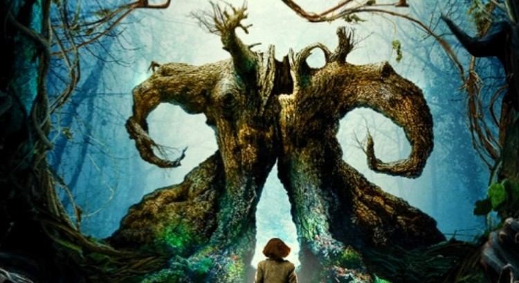
The multiple narratives constantly wrap around one another – there are no hard cuts between plot strands. One scene shifts by panning to a tree, which pans directly onto the next scene. It’s as if both battle scene and fantasy confrontation are part of the same world. It’s these poetic touches that soften the transition between what could have been incongruous elements.
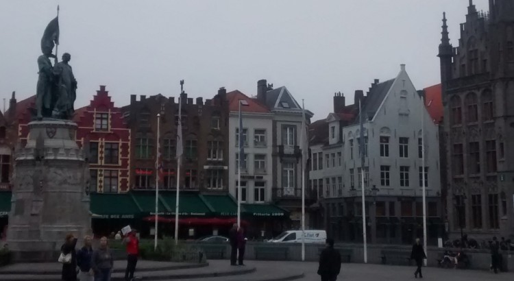
Bruges is a beautiful city and one which I loved visiting. Let me take you on a tour of the city in this autobiographical Bruges Travel Guide.
All aboard the Eurostar
It’s even light on our way down to the station, despite the hour. Spirits are high. There’s a bit of a cock-up when we arrive in London; the underground trains are delayed and diverted. But, having arrived on the first train of the morning, we’ve got plenty of time to get to the Eurostar at St Pancras International, and to admire the fantastic architecture of the Grand Midland Hotel.
Not sure what to expect from the Eurostar? It’s like catching a train at an airport. Take your reference number and feed to the machine that spits out your ticket, and then join the queue. Head through two sets of passport control and a metal detector then wait in the boarding lounge for your gate, I mean platform, to flash up on the monitor. The Eurostar is like a normal train but it has a bit more leg room and you don’t have to fight for a seat. By the time you’re leaving London’s most beautiful rail station behind you’re already hitting the kind of speeds that can cross three countries in two hours.
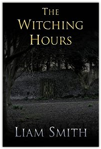
In my last post I discussed designing a book cover, examining how cover styles differ between genres and authors. I also introduced the cover I’d knocked up for my own book, The Witching Hours. Actually creating the cover was pretty enjoyable, and didn’t require any specialist software or skills. In this two-part post, I’ll take you through how I built both the front cover for my ebook and the composite front, back and spine required for the printed copy.
Prepare your canvas
I used Microsoft PowerPoint to create my ‘canvas’ – it’s software I’m familiar with, and one which I think offers pretty flexible formatting. After surfing around for the right dimensions for an Amazon ebook cover I found this helpful blog which gave me the right size: 42.3cm by 63.5cm; portrait.
This provides the correct dimensions for an ebook cover, but my printed book cover used slightly different dimensions. But let’s not over-complicate at this stage. We have our canvas.
It’s been a while since my last post. I can justify this, though, since I’ve still been writing – my novella The Witching Hours is now complete and live for download on Amazon. It’s been a really enjoyable experience: taking a story from its first few pages to the length of a full novella, editing it, having it proofread, revising and finally publishing it. I’ll likely write a full-length post about the publishing process and how I walked myself through it, but this one’s about something more specific. This is about designing book covers.
Never judge a book by its cover
‘Never judge a book by its cover’ goes the adage, but do we ever heed it? A cover is part of the experience of reading; part of the experience of the book. A picture paints a thousand words (a retaliatory adage there); it’s doing the job of your first few pages for you. I’ve certainly been enticed by some particularly fine book covers; I’ve deliberated for hours in Waterstones over which edition of Neil Gaiman’s Coraline to go for and drooled over the specially-bound bibliographies of Lovecraft and Poe. The fact is, as your browse the shelves of high-street bookshelves or the endless pages of ebook websites, the book’s cover is the feature that first grabs you. It first makes you want to read that book. It deserves attention and, like the title, is part of the entirety of the work.
I was keen to design and create my book cover myself. Not because I didn’t want to shell out for copyrighted images, but because I wanted The Witching Hours to be my work. Not just the words, but the entirety of it, the whole thing. This also put a handy limit on the ambition of the cover. I’m not a graphic designer by a long stretch, and knowing and sticking to my limits would prevent the cover from being too convoluted. Less is more. Simplicity is the glory of expression, in the words of Walt Whitman.
Different covers for different genres
I particularly enjoyed examining the book covers of Terry Pratchett as I was casting around for ideas. I enjoy Pratchett’s books; he’s wonderful at apying homage to multiple genres whilst often making a sharp point about some aspect of life. They work as fantasies, comedies, parodies and even social commentaries. It might be impossible to encapsulate all this in one cover but that’s fine. Pratchett’s books have been released with different covers. I’ll use one of my favourites, Mort, as an example.
My own copy of Mort (on the left) looks very much like a fantasy novel. Though less colourful than some of Pratchett’s other books, it’s kinetic. Its characters are caricatures with exaggerated features, keeping company with the archetypes of the high fantasy genre. Think swinging weaponry, mountaintop castles and the perhaps inevitable barely-contained boobs of a tag-along maiden. Reading the book, it becomes apparent that this display is as much satire as it is serious. But it’s highly at odds with the recent re-release of the Discworld books as striking, minimal, black editions. This matches the book’s more sober aspect and fits its musings over death and the passage of time. Special editions of some of the Death-themed books have also been released that have a wonderful tactile quality to them. Regretably, not something that can be transferred to an ebook.
I’m halfway through the literary feast that is Dracula Cha Cha Cha, the third book in Kim Newman’s Anno Dracula series. I’d been intrigued by Anno Dracula ever since I’d spotted it in Waterstones and admired its Victorian cover design, but I actually read it for the first time after borrowing it from my girlfriend a couple of years ago. I loved it from the first page. This is my Anno Dracula review.
Anno Dracula contains one of the best opening sequences I’ve ever read. A Jack the Ripper-style murder in London fog, seen through the eyes of the killer. It hooked me immediately. What follows is in essence an alternate history but also a reinterpretation of that most infamous of vampire novels, Dracula. Count Dracula escapes his hunters, the protagonists of Stoker’s story, and takes Queen Victoria as his bride. Meanwhile, a killer in Whitechapel is hunting down vampire girls and gorily dispatching them.
The author: Kim Newman
Newman’s skill as novelist isn’t just down to his writing style. In fact, I get the impression that his rich use of vocabulary and effective employment of descriptions are more a result of his foremost agenda. That is, synthesising different vampire mythologies and references into a new cohesive entity.