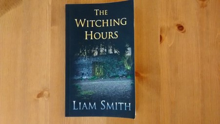
After self-publishing my novella complete with its cover art, I was desperate to get my hands on a physical copy of The Witching Hours. I’m a supporter of ebooks and e-readers, but there’s something to be said for holding a book in your hands; feeling its shape and taking in the tactility of it. I published my ebook though Amazon and CreateSpace, an Amazon company, offer a print-on-demand service for self-published authors. I’d already done the hard work – writing the book – and I couldn’t wait to have a printed copy of it too. This how to design a book cover, and its interior too.
I found CreateSpace a little less user-friendly than Kindle Direct Publishing. Nonetheless, it’s a fairly logical process and, like KDP, it begins with the trickiest bits – confirming your tax location and account details. Once this is complete, you can start the fun stuff.
Getting started: dashboard and setting up your title
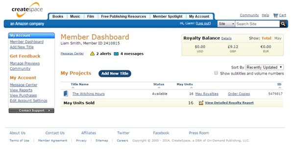
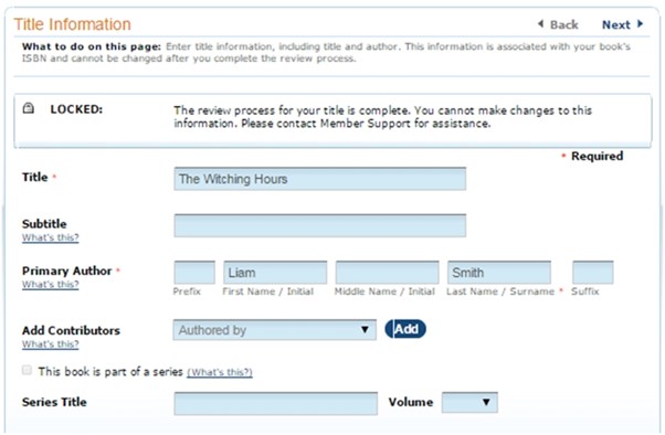
The member dashboard is your default page, and it is here that you can add a new title. This is first step of getting your book to the printing press. Clicking ‘Add New Title’ first prompts you to enter the basic information about your book: title, author, series… The bits you know like the back of your hand. I found this really exciting. It really felt like I was placing my work out there into the world of printed books.
How to design a book cover
Next come the two main tasks required for building your book – formatting the interior and creating the cover art. Both were a little fiddly and I hit a few speed-bumps along the way – bits that I will find easier when I work up to publishing my next book… Both interior and cover formatting depend on the size of your book. Createspace has quite a few options and many were larger than I expected. I opted for the comparatively small 5” by 8” size book; about the size of the Stuart MacBride novel I was reading at the time.
It also prompts you to choose your interior page colour – Cream or White. I went for Cream.It has a more ‘tempered’ feel than stark white, and looks less like a piece of home printing. A quick look at my bookshelf also confirmed that off-white is the predominant colour for fiction book pages. The two colours come with a slightly different page thickness, and this will affect the thickness of the finished book.
Formatting the interior
Although it’s less exciting than the process of designing a full-colour cover for your book, the interior must come first. The interior will dictate how thick your book is, and affect the cover design. You will upload your final, submitted interior file which will contain your story’s text, as a PDF, but Createspace has some templates for you to download and adjust for your own needs. I found the template with sample formatted content to be the most useful.
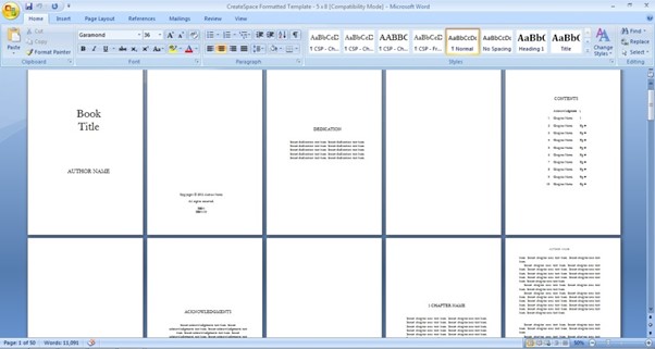
As you can see, it’s a simple matter of replacing the sample content with your own. It’s important to bear in mind which page will appear to the right or left in your finished book – the ‘Book Title’ page, though it appears first and to the left of the screen in Word, will actually be to the right of the spine in your book. The template has several other useful features set up for you:
Helping hands
- Page Numbers – It sounds trivial, but it looks professional to have your introductory pages denoted with roman numerals (i,ii,iii…) and your story pages denoted with basic Latin (4,5,6…). I changed the font of my page numbers to Trajan Pro to match my titles and headers.
- Alternating Headers – Another small one, but I know it would’ve taken me forever to work this out on my own. Headers in the template automatically alternate. That is, your name will top the first page, the title of your book the second, and so on. Or vice-versa: this is your book, and you make the rules.

- Size and Alternating Margins – I was dreading setting these up. So I was over the moon to discover the template was already calibrated to the right settings. The template has a larger slightly larger margin on the spine-side of each page, so that each page will look balanced when the book is assembled
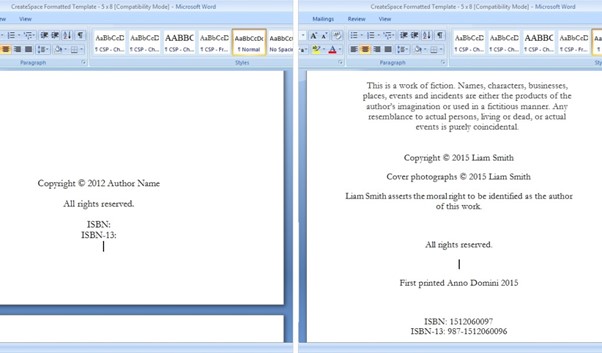
- Disclaimers – Ok, it doesn’t give you the full ‘this book is a work of fiction’ disclaimer, but it gives you a page to place it on. I found this guide useful for setting up the disclaimer at the start of my book – remember your ISBNs too!
There are still some bits to decide on for yourself, however. The template automatically has Garamond set up as the font. After playing with other fonts, I decided I liked Garamond just fine, and enjoyed how it looked in italics too. I used this guide to fonts as a reference and learned a fair bit about popular fonts in the process. In the end I went for a font size of 11. I didn’t want to make it look as if I were trying to bulk out my story to a larger page count, and thought that this size looked nice on the page.
Saving and uploading your book
Once you’ve set up the interior to your liking, there’s only one thing left to do – convert it to PDF format. Initially, I used Word’s own ‘Save As’ function to save the file as a PDF. But when I submitted it, Createspace flagged an issue – my font had become pixellated. Convinced the problem was the font, I spent hours re-downloading and re-installing Trajan Pro on my laptop before realising that the problem was in the export and not the font. I consequently used Nitro Pro, a brilliant free program for Windows, to export my document with wholly satisfactory results.
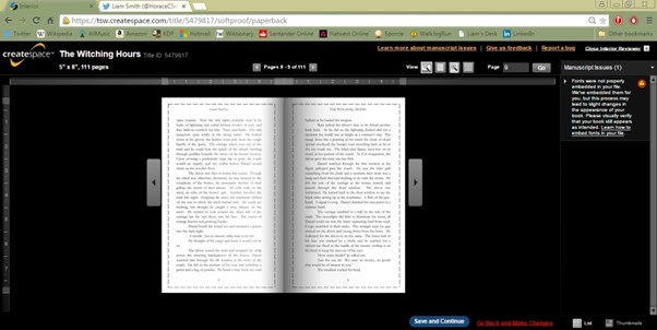
Once you upload your file, you get the opportunity to review it digitally via an ‘Interior Reviewer’ on Createspace. This is really handy; you see every page where it’s meant to be and with the formatting and fonts you’ve selected all in place.
With your interior finalised, all you need is something to wrap your book in…
Building a Paperback Book Cover
An ebook cover is simple – a single image you can whip up with only the most basic of programs. The good news is that you can use the same programs to build your full paperback cover – even if the process is a little more complex. As with an ebook cover, keeping it simple is probably the best way to work through this process. The first decision is easy though – do you want a matte or glossy finish? I went for matte, as I felt glossy might be at odds with my dark cover and ghostly subject matter. I wouldn’t change to glossy but my matte black cover does show up fingerprints a bit too clearly.
As with your interior formatting, Createspace will direct you towards a helpful template to help you assemble your book cover. Enter your book details – its size, paper colour, page count (that’s including title pages, disclaimers and story text) and download a calculated PNG of your template. Note that the template includes a lot of white space. This is intentional, as your final submission will consist of your cover seemingly floating on a larger piece of paper.
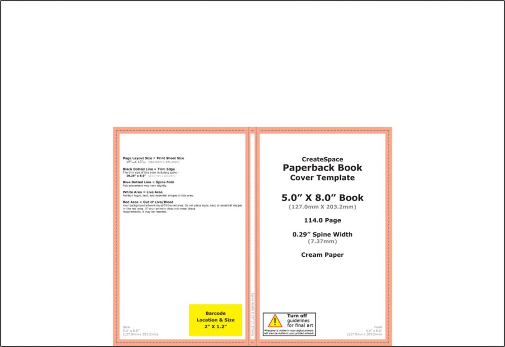
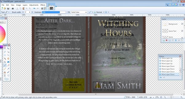
I opened up the template in the ever-reliable Paint.NET, and kept it on its own layer, named ‘Background’. Throughout the construction of the cover, I kept it on the topmost layer. This way, when I adjusted its transparency, I could double-check that my images were within the boundaries of the template. Each element of the cover – front, back and spine – each had their own layer. I could turn each one visible or transparent at any time in order to work without complication.
Front cover
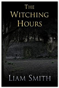
My front cover is, of course, the same as my ebook cover. So the hard work was already done for me! I added the cover image without text to the template since the dimensions were a little different to the digital cover and I didn’t want the text to stretch. I added a larger black fade to the left of the image too – the printer is not exact and the pink area of the template represents its margin of error. By fading this area of the image, I could ensure there wouldn’t be a misplaced ‘hard’ join between cover and spine.
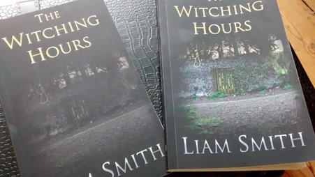
Following receipt of my first proof copy of the book, I thought the cover came out too dark. I brightened the image before requesting a second proof.
Back cover
As shown on the image above, I used an image of tree branches to form an unobtrusive back cover to the book. On my first proof copy of the book, this didn’t come out at all; the image was too dark. When my second proof arrived, I was too happy with my brightened front cover to notice that the back still wasn’t bright enough to be visible! Too late though – I’d already clicked the confirm button and released my book into the published world. If I re-design for a future edition, I’ll fix this image, although the plain black back cover is by no means detrimental to the appearance of the book. The barcode, which Createspace adds to the back itself, actually relieves some of the blackness.
The blurb took me a few hours to write. I didn’t want to reveal any plot points in it but wanted to stay true to the book’s tone. I also tried to write something a bit rhythmic, so that one sentence set up and rolled into the next, enticing a potential reader to at least finish the synopsis.
Spine
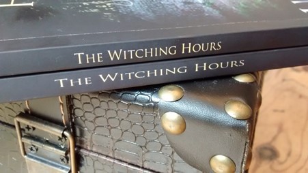
A spine is smaller than you think. On my first design, my lettering encroached a little too much into the pink area of the template, and the process squashed it a little. I reduced the size accordingly and the effect was much better on my second proof. The spine may be small but mistakes are still noticeable, and it’s much better to have a small but well-formed image than a larger, poor-quality one. In the spirit of keeping it simple, I designed an all-black spine. That way, the black fades on my covers would join seamlessly with it.
Exporting your book
You will need to submit your completed cover as a PDF. As with my interior, I exported using Nitro Pro, which works by ‘printing’ the document into PDF format. Remember that all that white space surrounding your cover needs to be included in the file. I played with the printer properties, maximising quality where I could. The print area required is denoted on the template – mine was 482.6mm by 330.2mm, and I set this up as a custom paper size.
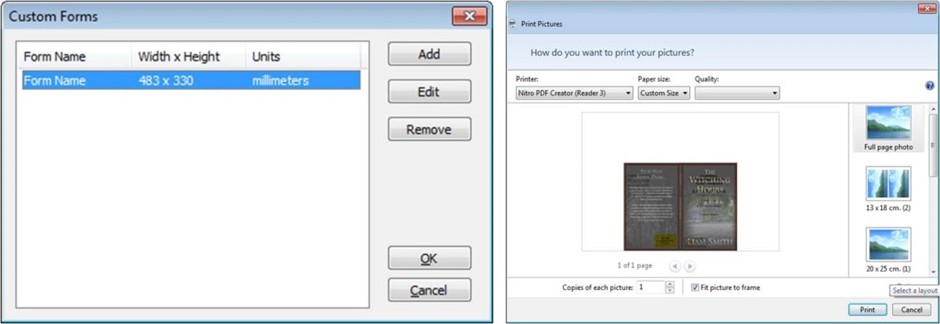
I also checked ‘Fit picture to frame’ – this aligned the image to the edge of the page rather than adding a border, which would be required if it was actually being printed, rather than just being converted to PDF format.
Once this is uploaded, it will be processed by Createspace. I waited overnight for an email confirming the submission was successful. It is also at this point that issues – such as my problem with my spine size – will be brought to your attention. Once the submission is accepted (and you can ignore the issues if you like) you can order a proof copy of your book. This is essentially what the book will look like, with the addition of the words PROOF printed into the final page. This will enable you to check over your book before finally making it available for purchase. Bizarrely, although the final book is available to print on demand in the UK, the proof copy had to be ordered from the USA. I shelled out for the fastest delivery, desperate to see if the hard copy was up to scratch, and told myself my ebook sales were covering the extra cost.
Be patient and wait for your proofs!
It took a couple of proof copies to finalise my book, but I’m glad I took the time to have these delivered – it was tempting just to hope the book was ok and release it for purchase. It was worth the extra time and money to ensure I was satisfied with the final copy.
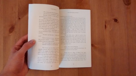
I found assembling the paperback incarnation of my book much more challenging than the digital copy, but loads more rewarding. I learned a lot about book formatting and expanded my knowledge of my favourite software and, of course, got my very own book out of it! Some parts were trickier than others, and I hope this post helps to clarify anything for anyone wanting to get their work out there – I’d recommend self-publishing to any writer.
